
My Role: UX Researcher, UX Designer
Conception to delivery
Tools: Adobe XD, Photoshop
Pen & Paper

Project Duration: 8 Weeks
Project Type: Course Case Study
Responsibilities: Conduct interviews and usability studies, competitive audits paper and digital wireframing, low and high-fidelity prototyping, and iterating on designs, accounting for accessibility.
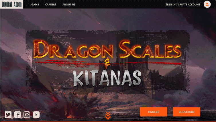
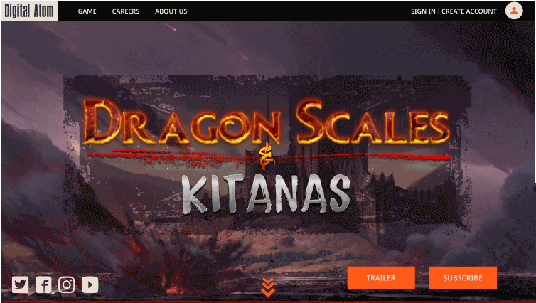
Desktop

Tablet

Mobile

The Problem
Gaming websites have lengthy, elaborate or confusing sign up processes.
The Solution
Design a website that allows users to quickly and easily create a new account.
The Challenges
Website design was never a strong area for me, so I decided to change that and work on something that challenged me creatively.

The Users
To begin, I had to find out who I’m designing for and identify user pain points for this site.
Research
I conducted interviews and created empathy maps to understand the users I’m designing for and their needs. I discovered that many target users like to join a video game’s community and engage with the content on its website. I also uncovered how many users dislike the sign up process.
Empathy Maps
My research revealed user pain points that helped me create empathy maps to determine who potential target users would be.

“If I'm making a quick profile for something, I want to be able to do it and get done with it”. -Participant D
“I also hate security challenges like capture.”
- Participant C


“I dislike having to go to my email to confirm my email
before continuing.” -Participant B
“I hate when they ask a lot of questions, and when they have you log in with a username that is different from your email” -Participant A

Personas
Creating personas helped expose potential problems and helped highlight potential users.

User Journey
Creating a user journey map helped identify possible pain points and improvement opportunities. Mapping this journey helped me define how the main user flows should work and gave me feel for what the design architecture could be.


Define
Now, with a good understanding of my users, I was able to set a clear goal by defining the problem using crafted problem statements.
Problem Statements
Sanari is a busy professional and avid gamer who needs an easy, intuitive and safe sign and profile creation process because they want to sign up for the game’s community and create a unique profile.
Ideation
Now having a clear understanding of potential user’s problems, it’s time to design solutions.
Competitive Analysis
Through the competitive audit I conducted, I experienced many different sign up processes. Some were relatively simple, others were a bit tedious and time consuming. This is off-putting for many users and can slow down or completely stop the onboarding process.

Sitemap
The process of signing up for a website was a primary pain point for users. Armed with that knowledge I created this sitemap.
An easy, yet secure sign up process was my goal.
Easy navigation and account control was also my focus.


How Might We
As part of the ideation process I wanted to reframe the problem statement into questions that prompted me to come up with ideas for design solutions.
Amp up the good- I know there are a lot of ways to sign up for a website, so I thought about some of the best ways that can happen:
How might we make the sign up experience fun, easy to use, and engaging?
Change a status quo- Thinking about the research finding that sign ups can be annoying and time consuming:
How might we design something that is quick and easy?
Break the point-of-view into pieces-
How might we improve the sign in process to be safe and secure but also quick?
Could we add security features after the sign up process once in the profile screens?
What customization features can we add to make the process fun and unique?
Crazy Eights
To help answer some of these questions I did a Crazy Eights exercise to generate ideas.

Sketches & Wireframes
When creating paper wireframes my focus was to
address gaps identified, pain points and answer my questions.
Paper Wireframes
I sketched out paper wireframes for each screen of my site, keeping the user pain points about sign in, navigation, and account control in mind.
The home screen paper wireframe variations focus on optimizing the website experience for users.


Stars were used to mark the elements of each sketch that would be used in the initial digital wireframes.

Refined paper wireframe
Paper Wireframes Screen Size Variations
Because users of the website will access the site on a variety of different devices,
I created designs for additional screen sizes to make sure the site would be fully responsive.
Tablet View

Mobile View

Digital Wireframes
Moving from paper to digital wireframes made it easy to understand how the redesign could help address user pain points and improve the user experience.
Prioritizing useful button locations and visual element placement on the home page was a key part of my strategy.


Digital Wireframes Screen Size Variations
Keeping the same aesthetic and easy navigation I created screens for mobile and tablet.
Mobile View
Tablet View


Prototype
After coming up with initial designs and creating wireframes, it was time to put it all together and see how it works.
Low-fidelity prototype
To create a low-fidelity prototype, I connected all of the screens involved in the primary user flow of signing in or creating an account, then navigating the account pages.
I had received feedback on my designs from my peers and I implemented some suggestions in places that
addressed user pain points.

Testing
With a working prototype I needed to see if my design actually provided users with real solutions and addressed pain points.
Usability Studies
Findings from the low-fidelity prototype helped guide the designs from wireframes to mockups.

Results


Iteration
With a clearer picture of how my designs worked for users, it was time to refine designs, decide on the look and color palette for the site.
Color Palette

Mockups
Based on the insights from the usability study I made changes to the site’s navigation.
From the homescreen, there was no link to create a new account because it was buried in the “Sign In” page. I added a new link next to the “Sign In” link so users can create a new account from the main page.
Before usability study
After usability study

Users pointed out the lack of a “contact” link should they want to contact the developer. So, I added a link to a contact page in the footer.
Before usability study
After usability study

Final Mockup Screens


High-fidelity prototype
My hi-fi prototype followed the same user flow as the lo-fi prototype, sign in/create an account and navigate through the account pages.
The prototype included the design changes made after the usability study, as well as several changes suggested by my peers.

Create An Account Flow

Sign In Account Flow
Accessibility Considerations
I had also taken steps to ensure that the app was
accessible to as many users as possible.

Going Forward
After going through the entire design process it was time for me to reflect on the impact of my work and what I learned along the way.
Outcomes


Next Steps
