The Game Place
My Role: UX Researcher, UX Designer
Conception to delivery
Tools: Figma, Photoshop. Pen & Paper
Project Duration: 12 Weeks
Project Type: Course Case Study
Responsibilities: Conduct interviews and usability studies, competitive audits paper and digital wireframing, low and high-fidelity prototyping, and iterating on designs, accounting for accessibility.


The Problem
Families and individuals need a way to quickly search and preview the games at the arcade.
The Solution
Create an dedicated app that allows users to preview all games, read reviews and ratings, plan a trip and make use of incentives.
The Challenges
This was the first full project that I had to design from concept to delivery. I was able to go through the entire design process and practice all that I had learned.

The Users
My first step was figuring out who I’m designing for and identifying user pain points for this app.
Research
I developed interview questions and conducted interviews and created empathy maps to understand the app’s users and their needs. The research I conducted revealed two types of user groups: those who like playing ticket games and those who like playing video games.
These two groups confirmed some initial assumptions about the types of users who visit arcades, but research also revealed there is some overlap in these user groups. Additionally, I was able to uncover user motivations, preferences and dislikes when it comes to visiting an arcade as well as using similar apps.
Empathy Maps
My research uncovered user pain points and helped me create empathy maps to hone in on who potential target users would be.

"The price, is it one coin, two, three, you know. I'm always going for the cheapest games. Because a value, I'm a big value guy. So price is definitely one of the very big ones." -Participant A
"I need info and reviews. Like that how many times it's downloaded, how many people use it. Because then they'll let me know whether it's worth it or not." -Participant D


"I'm a visual learner. And I like to preview what I'm going to be spending my time doing.." -Participant E
"I want to see what the game looks..." -Participant B
"...for me, I want to have an idea of the lay of the land and what's actually there." -Participant C

Personas
Creating personas highlighted potential problems and gave me a real sense of what the design architecture could be.
It also helped me define how the main user flows should work.


User Journey
Mapping this userjourney revealed that users need a way to easily find games to play and share with their family.

Define
With a good understanding of my users, I am now able to set a clear goal by defining the problem using crafted problem statements.
Problem Statements
Jess is a working mother of three who needs a way to plan a fun, family outing because she wants to maximize ticket collection and get cool prizes.
Samuel is a working professional who needs a way to find retro video games cabinets because he wants to play as many retro arcade cabinets as possible..
Ideation
Armed with an understanding of potential user’s problems, it’s time to design solutions.
Competitive Analysis
To find out what will be unique about The Game Place app,
I selected direct and indirect competitors with similar services to analyze. Doing so helped me to identify what they are doing well that could
inspire my designs as well as gaps in their services.

Sketches & Wireframes
When creating paper wireframes my focus was to
address gaps identified in the competitive audit
and present information easily.
Paper Wireframes
I started simple and soon began iterating on the ideas of the previous sketch. I was looking for ways to address user pain points. I also wanted to prioritize quick navigation to make moving around the app as easy as possible.


Digital Wireframes
After ideating and drafting paper wireframes, I created the initial digital designs for the app. These designs focused on
easy and accessible navigation and visual elements.
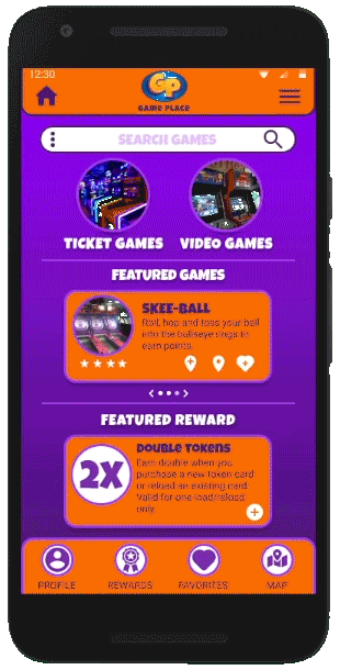
Home Screen
I wanted navigation and searching to be easy and always available
to the user.
I used feedback and findings from my user research.


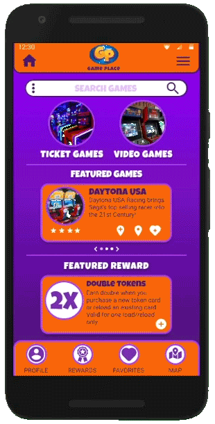
Game Info Screen
On subsequent screens navigation should be easy.
I also wanted the game info to be easy to view and read to help address user pain points.
Prototype
After coming up with initial designs and creating wireframes, it was time to
put it all together and see how it works.
Low-fidelity prototype
The low-fidelity prototype connected the primary user flow of searching for a game, viewing the game info, adding the game to favorites, then viewing users favorites page.

Testing
With a working prototype I needed to see if my design actually provided users with real solutions and addressed pain points.
Usability Studies
I conducted two rounds of usability studies. Findings from the first study helped guide the designs from wireframes to mockups. The second study used a high-fidelity prototype and revealed what aspects of the mockups needed refining.


Iteration
Through pattern and insight identification I had
a clearer picture of how my designs worked
for users, it was time to refine designs.
Mockups
Based on the insights from the usability studies, early designs were too bland so I fleshed out the UI and added a bit of fun to the design in hopes to make navigation easier and the user experience more enjoyable.
Before usability study 1
After usability study 1

To address some pain points after the second usability study,
I cleaned up the UI, added features and functionality and made more accessibility considerations like icon indications and better color contrast.
Before usability study 2
After usability study 2

High-fidelity prototype
The final high-fidelity prototype presented cleaner user flows for searching and selecting a game. It also streamlined adding a game to a favorites list and the map. Accessibility considerations helps with navigation and readability.

Search Games Flow
Add Favorite Flow
Add To Map Flow

Accessibility Considerations
I had also taken steps to ensure that the app was
accessible to as many users as possible.

Going Forward
After going through the entire design process it was time for me to reflect on the impact of my work and what I learned along the way.
Outcomes


Next Steps
