
My Role: UX Researcher, UX Designer
Tools: Figma, Photoshop, Pen & Paper
Project Duration: 4 Weeks
Project Type: Social Good,
Course Case Study
Responsibilities: Conduct interviews and usability studies, competitive audits paper and digital wireframing, low and high-fidelity prototyping, and iterating on designs, accounting for accessibility.
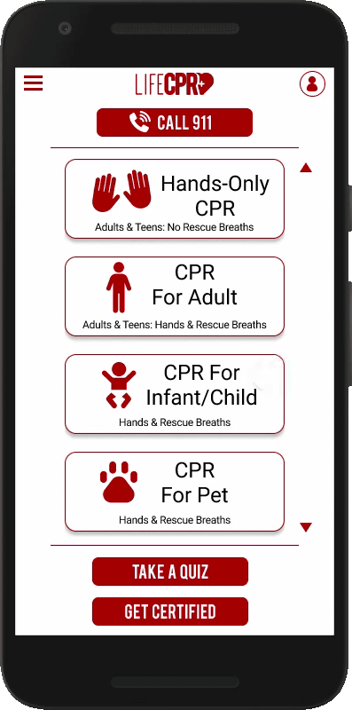
Dedicated Mobile App

Companion Website

The Problem
Some online CPR lessons are only available on certain devices and do not offer a robust form of learning.
The Solution
Create a dedicated app and a responsive website to provide users with easy, comprehensive CPR lessons and other life saving procedures.
The Challenges
Scope and time were two of my main challenges. I was going to have to rely on my experience working under tight deadlines to
accomplish my goal.


The Users
Time to figure out who I’m designing for and identify user pain points.

Research
I developed interview questions that would give me data on the user’s learning habits and experience with CPR. The feedback received through conducted interviews revealed that users
could definitely benefit from a quick, easy and
accessible way to learn CPR.
The interviews revealed users’ motivations for learning CPR and their experience levels. They also revealed the different ways people like to learn and potential pain points.
Empathy Maps
With all the feedback I received, I then created empathy maps which allowed me to hone in my potential target users.

Personas
Using details from the empathy maps I was able to create personas to highlight potential users.


User Journey
Creating personas highlighted potential problems and gave me a real sense of what the design architecture could be.
It also helped me define how the main user flows should work.


Define
With a good understanding of my users, I am now able to define the problem using crafted Problem Statements.
Problem Statements
Molly is a working mother who needs a quick and easy way to learn CPR because she wants to get certified and share her knowledge with her children.
Claude is a working professional who needs easy-to-use lessons that carry over to other devices because he wants to be able to access the information anytime.

Ideation
Armed with an understanding of potential user’s problems, it’s time to design solutions.
Competitive Analysis
To find out what will be unique about LifeCPR’s app, I selected direct and indirect competitors with similar services to analyze. Doing so helped me to identify what they are doing well that could inspire my designs
as well as gaps in their services.

Sketches & Wireframes
I did a quick Crazy Eights exercise, then made some paper wireframes. My focus was to address gaps identified in the competitive audit and present information easily.


Digital Wireframes
After ideating and drafting paper wireframes, I created the initial designs for the app. These designs focused on
easy and accessible navigation and visual elements.


Prototype
After coming up with initial designs and creating wireframes, it was time to
put it all together and see how it works.
Low-fidelity prototype
To create the low-fidelity prototype I connected all the screens that created the primary user flows of viewing a lesson, taking the quiz for that lesson and for completing a purchase for a CPR certification class.

Testing
With a working prototype I needed to see if my design actually provided users with real solutions and addressed pain points.
Usability Study
I conducted an unmoderated usability study to test my ideas. The study uncovered some unique findings.

Results

Iteration
With a clearer picture of how my designs worked
for users, it was time to refine designs.
Mockups
Based on the insights from the usability studies, I applied design changes like providing a clearer description of CPR lessons on the home page as well as better navigational cues.

Additional design changes included adding the question numbers above the questions for each quiz page.

High-fidelity prototype
The high-fidelity prototype followed the same user flow as the low-fidelity prototype, including design changes
made after the usability study.

Lesson User Flow
Quiz User Flow

Certification Flow
Accessibility Considerations
I had also taken steps to ensure that the app was accessible to as many users as possible.

Responsive Web Design
With the app designs completed, I started work on designing the responsive companion website.
Sitemap
I created a sitemap based on primary user flows to guide the organizational structure of each screen’s design to ensure a cohesive and consistent experience across devices.

Responsive Designs
Using the progressive enhancement approach I optimized the designs to fit specific user needs at each level.

Going Forward
After going through the entire design process it was time for me to reflect on the impact of my work and what I learned along the way.
Outcomes


Next Steps
